Plotting Intro
Gliderpy has a plotting interface for quick simple diagnostic figures they are: plot_ track, plot_ctd, and plot_transect for plotting the glider track, a vertical transect for a specific variable, or a single cast (glider dive). Let’s take a look on how to use them. First we will load a glider dataset as a pandas DataFrame.
[1]:
from gliderpy.fetchers import GliderDataFetcher

glider_grab = GliderDataFetcher()

glider_grab.dataset_ids = ["whoi_406-20160902T1700"]
dfs = glider_grab.to_pandas()
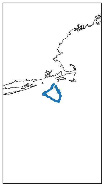
plot_track
The plot_track method will returns a map with the glider’s track.
[2]:
df = dfs["whoi_406-20160902T1700"]

fig, ax = df.plot_track()
/home/runner/micromamba/envs/TEST/lib/python3.14/site-packages/cartopy/io/__init__.py:242: DownloadWarning: Downloading: https://naturalearth.s3.amazonaws.com/10m_physical/ne_10m_coastline.zip
  warnings.warn(f'Downloading: {url}', DownloadWarning)
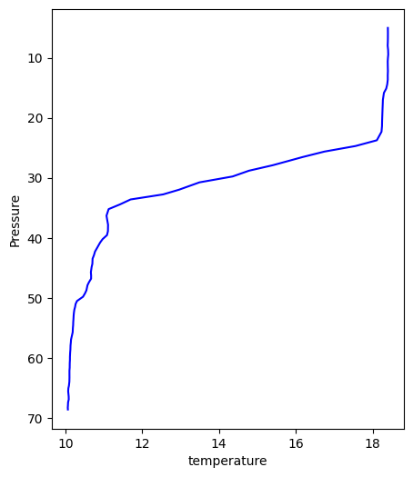
plot_cast
This method groups all the casts by their position (latitude and longitude) giving the user access to each individual cast using the index (profile_number) of the grouped DataFrame.
[3]:
fig, ax = df.plot_cast(profile_number=0, var="temperature", color="blue")
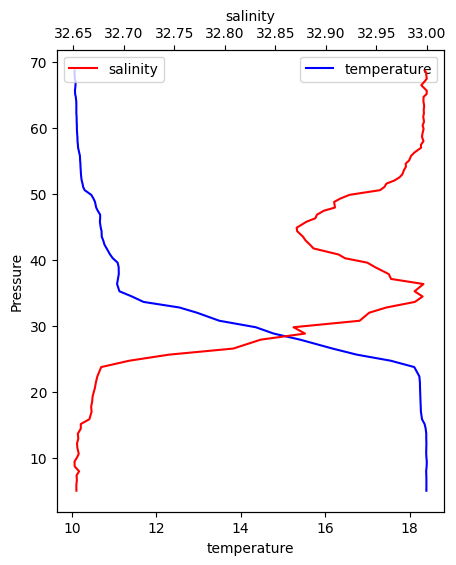
All the methods accept and ax argument and more complex figures can be create. For example, let’s add a second variable to the cast above.
[4]:
fig, ax0 = df.plot_cast(profile_number=0, var="temperature", color="blue")

ax1 = ax0.twiny()
df.plot_cast(profile_number=0, var="salinity", color="red", ax=ax1)

ax0.legend()
ax1.legend()
[4]:
<matplotlib.legend.Legend at 0x7f0909e93230>
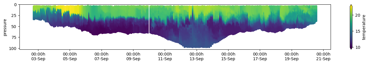
We can check a whole transec with the plot_transect method.
[5]:
fig, ax = df.plot_transect(var="temperature", cmap="viridis")
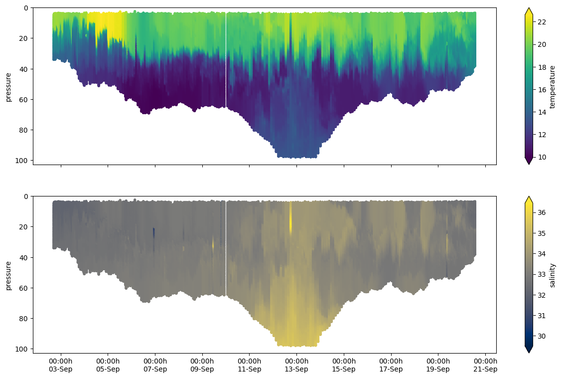
Using a given matplotlib we can create a fancier version with two variables in a subplot.
[6]:
import matplotlib.pyplot as plt

fig, (ax0, ax1) = plt.subplots(
    figsize=(15, 9),
    nrows=2,
    sharex=True,
    sharey=True,
)

df.plot_transect(var="temperature", ax=ax0, cmap="viridis")
df.plot_transect(var="salinity", ax=ax1, cmap="cividis")
[6]:
(<Figure size 1500x900 with 4 Axes>, <Axes: ylabel='pressure'>)