Interactive Figures
Interactive Figures | Guide
An in-depth guide for how to create Interactive figures. Currently, there are two types of Interactive Figures offered by Graphic Data. Currently, there are two types: Bar Charts and Time Series.
Hierarchy: Instance Type → Instances → Scenes → Modals → Figures (We are Here).
When Finished Making Field Selections: Press “SAVE” in the top right of the page.
Fields Covered:
- Workflow Checklist
- Graph Type
- File Upload
- New Upload
- Existing Upload
- Time Series Line Charts
- Barcharts
- Best Practices
Workflow Checklist
- Save the post first.
- Upload your CSV/JSON file.
- Example files: Sample CSV, Sample JSON
- Configure axes (titles, bounds).
- Choose number of bars or lines.
- Adjust style (markers, error bars, colors).
- Preview before publishing.
⚠️ Important: You must save the post before uploading a file.
File Upload
New Upload
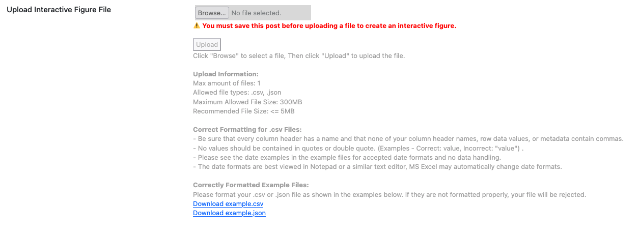
Screenshot: Uploading a new CSV/JSON file.
Existing Upload
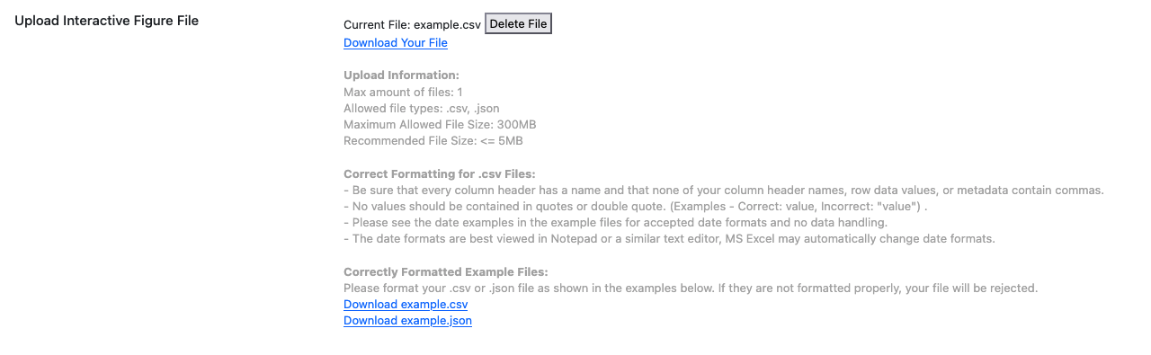
Screenshot: Selecting an already uploaded CSV/JSON file.
Steps:
- Save your post.
- Use the upload field to select or add a CSV/JSON file.
- Once uploaded, additional chart configuration fields appear.
💡 Tip: CSVs should have clear headers (e.g., date, value). Dates should be in YYYY-MM-DD format.
Graph Type
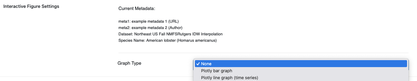
Screenshot: Select the type of graph you would like to create.
Bar Charts or Time Series.
Bar Charts
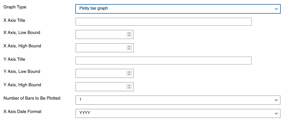
Screenshot: Bar chart configuration panel.
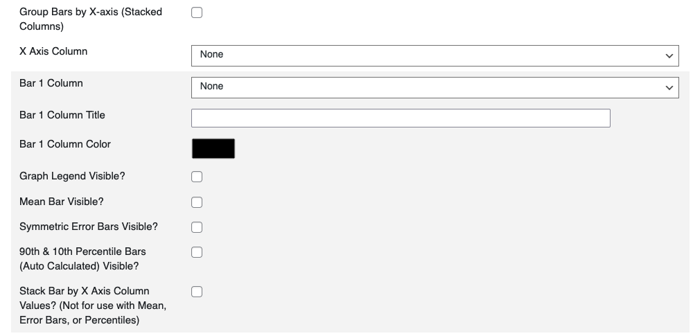
Screenshot: Bar chart configuration panel.
What it does: Creates a bar chart from uploaded data.
When to use: For categorical comparisons (e.g., values per category).
Required: Data file, X axis column, Y axis column.
Steps:
- Choose Graph Type → Bar Chart.
- Map your CSV columns: one for X axis (categories), one for Y axis (values).
- Set X and Y axis titles.
- Adjust bounds if needed (e.g., set Y axis minimum to 0).
- Enter the number of bars to display.
Options:
- Axis bounds (low/high).
- Bar grouping/stacking options.
💡 Tips:
- Keep category names short.
- If bars overlap, reduce the number of bars or adjust group spacing.
Time Series

Screenshot: Time series configuration panel.
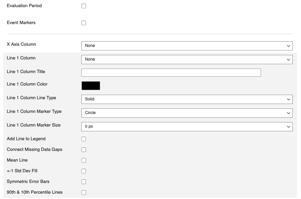
Screenshot: Line and marker options for time series.
What it does: Plots data values over time.
When to use: For continuous measurements (e.g., monthly temperature).
Required: Data file with a date/time column for X axis and one or more numeric columns for Y axis.
Steps:
- Choose Graph Type → Time Series.
- Map X axis to the date column.
- Map Y axis to one or more numeric columns.
- Set axis titles and bounds.
- Choose number of lines to plot.
- Configure line/marker style: shape, size, and color.
- Add overlays if needed: mean line, ±1 standard deviation, error bars, percentile bands.
- Set evaluation period shading if required.
Options:
- Number of lines.
- Marker customization.
- Error bars.
- Evaluation period (start/end).
💡 Tips:
- Use consistent date formats (
YYYY-MM-DD). - Always preview to check for gaps in data.
- Keep legends clear by naming your columns well.
Best Practices
- Keep files small (<2 MB) though you can upload up to (300 MB).
- Use descriptive column names (
date,value,series). - Always preview before publishing to confirm layout and data correctness.