What’s on this page?
- Overview
- Open the Data Portal
- Add Data Layer to the map
- Navigating the Map Layer
- Exploring the Data
- Filtering Data
- Keyword Filtering
- Polygon Selection
- Adding/Comparing Sea Surface Temperature
- TOPIC: Comparing Data with Data Views
- The Data View
- Finally: The Feedback Button
- Appendix: Using the Real-time Sensor Layer
- Appendix: Advanced Filtering
- Appendix: MBON Data View Challenge
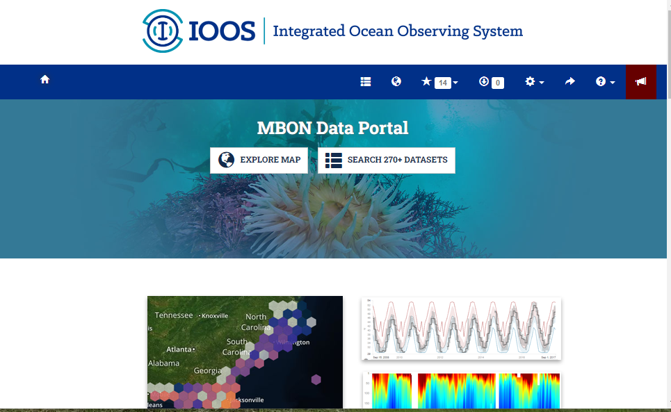
Overview
20 Years of Data
About this document
CeNCOOS (https://www.cencoos.org) (Central and Northern California Ocean Observing System) working with the BeachCOMBERS program, aggregated beach cast surveys of marine mammals and seabirds from BeachCOMBERS, Beach Watch (https://farallones.org/beach-watch), and the Marine Mammal Stranding Program (http://gsp.humboldt.edu/Projects/MMSP/Site1/aboutus.html) at Cal Poly Humboldt. These data, when combined cover surveys from Del Norte County down to Los Angeles County for over 25 years. These data have been made available in the Marine Biodiversity Observation Network Data Portal (https://mbon.ioos.us/), which in addition to the COMBERS data, is jam packed with other marine data including data from moorings, satellite, R.O.V surveys, and oceanographic and atmospheric models.
Here, we are going to walk through some of the tools in the portal and access some of the COMBERS data that many of you have helped collect.
Note: If you get lost or want to skip ahead, there are links to the portal along the way.
Open the Data Portal
Note: The data portal works best using the Firefox and Chrome web browsers.
The MBON Data Portal can be accessed by going to https://mbon.ioos.us The portal has two main components:
- The Map Layer
- The Data Catalog (which can also be accessed in the Map Layer)
To get to the Catalog Layer click on the Search 270+ Datasets button.
Now let’s search for the BeachCOMBERS data. This is part of the Data Layer named Effort-based surveys, Northern and Central California Beaches: Seabirds and Marine Mammals, but the Data Catalog is pretty smart and each dataset includes a set of tags that are used to classify different types of data.
Note: There are many advanced ways to filter queries in the Data Catalog that we won’t be covering here, but can be accessed by selecting the Advanced button underneath the search bar
Link to the Catalog Search interface: https://mbon.ioos.us/#search?type_group=all&page=1
Add Data Layer to the map
Once we find the dataset we want (Bird Carcasses from Effort-based surveys, Northern and Central California Beaches:
Seabirds and Marine Mammals), we can add it to the Map Layer by selecting Add to map button for the appropriate
Layer.
Here we also can read a narrative about the dataset, which includes a description of how different metrics are calculated as well as a link to the ISO metadata record for those who want to dive deeper.
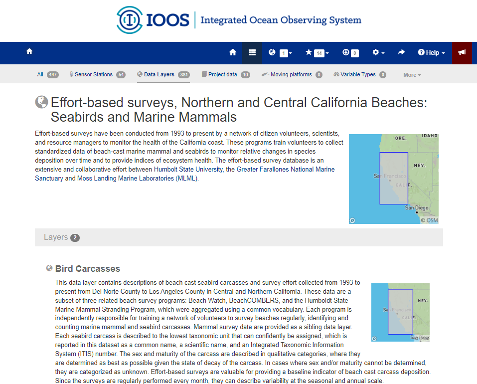
Link to dataset metadata and layers: https://mbon.ioos.us/#module-metadata/89c64bd6-c1e2-4cc9-bdbf-2efa61586b50
Navigating the Map Layer
Click on the Map Button.
Here we can visualize many types of data both spatially and temporally.
Each different dataset is called a Layer.
There is a lot going on here! Let’s focus on the blue Navigation Header at the top of the portal.
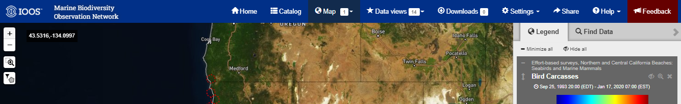
There are nine Tabs here:
- Home - This takes you to the MBON Data Portal home page.
- Catalog - This takes you to the Data Catalog.
- Map -This will take you to the Map viewer. If any datasets have been added to the map, they will appear.
- Data Views -These are collections of plots from different Data Layers (we’ll come back to this soon).
- Downloads - If you want to download multiple datasets, this shows what is in your download queue.
- Settings - Here you can change things like the Units, color schemes, base layers for the map, and many other options.
- Share -This will generate a unique url to what you are currently seeing in the portal. This can be shared with others or used to regenerate the portal in its current state.
- Help - Here you find links to the help documents and an interactive guide to the portal
- Feedback -This is a great way to report bugs, ask questions, or open a line of communication with us! We track all of the feedback and appreciate any comments.
Exploring the Data
Now let’s go back to the map by clicking on Map button.
It looks very busy, so let’s go over how to use the Map.
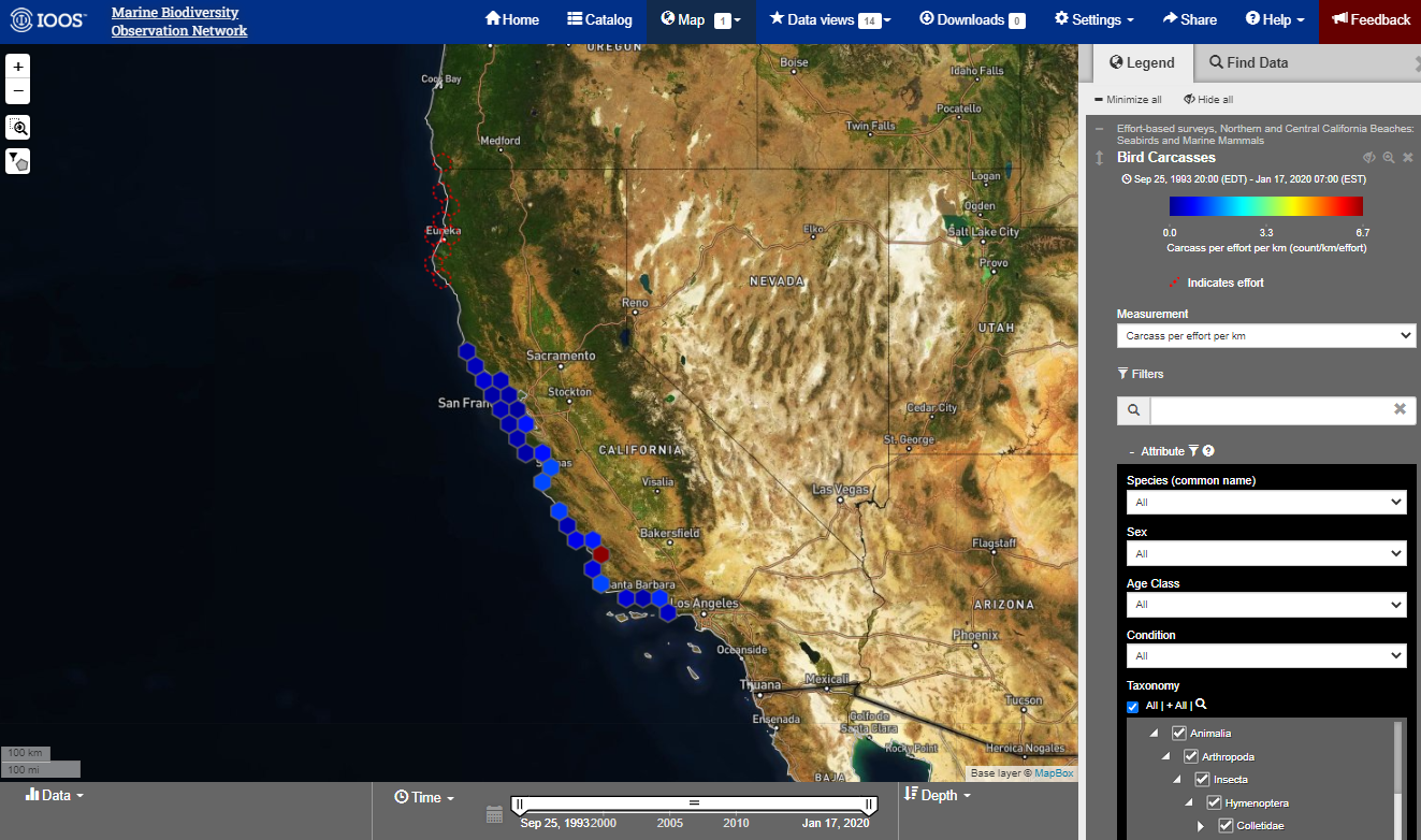
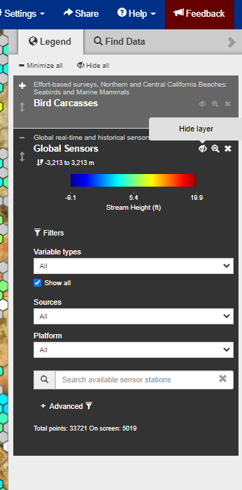
Currently, we have two data Layers loaded up. First the bird carcass layer and the Global sensors layer (See Appendix for how to use this layer).
In the meantime, let’s hide this layer.
Under the Legend tab select the eyeball icon with a slash next to the title of the layer. Selecting this again will re-enable the layer.
Zooming into Monterey Bay
Zooming in the portal can be accomplished a couple of different ways:
- The Plus and Minus Buttons
- The Magnification Tool: Drag a rectangle over the region that you want to zoom to.
- Zoom in/out with a scroll wheel or by doub1e clicking on a region.
Now that that is done, we should only be able to see Seabird Carcass surveys. Each dot on the map corresponds to a survey site.
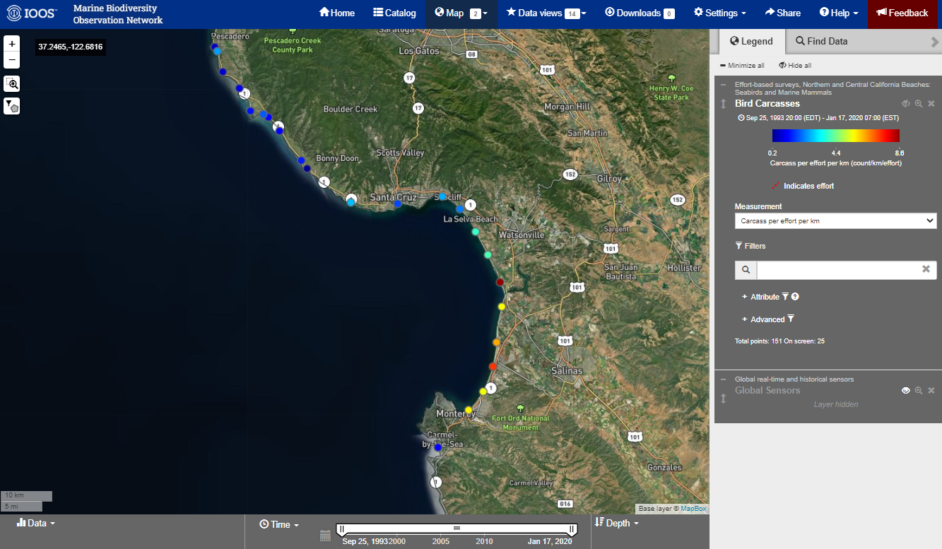
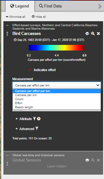
Let change the default measurement to display the Count instead of Carcasses per effort per km. Click on the Measurement drop down menu in the Legend and select Count.
Now hover the mouse over a site and see what happens.
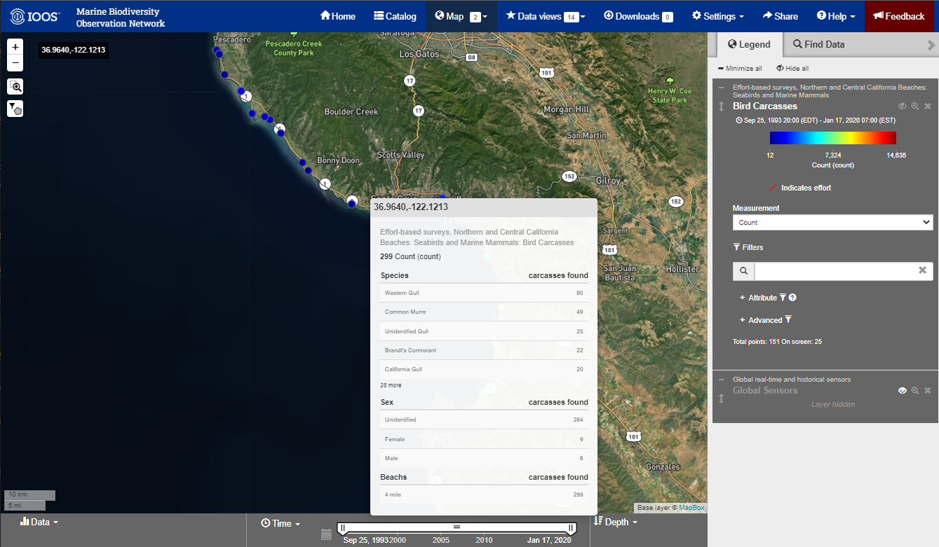
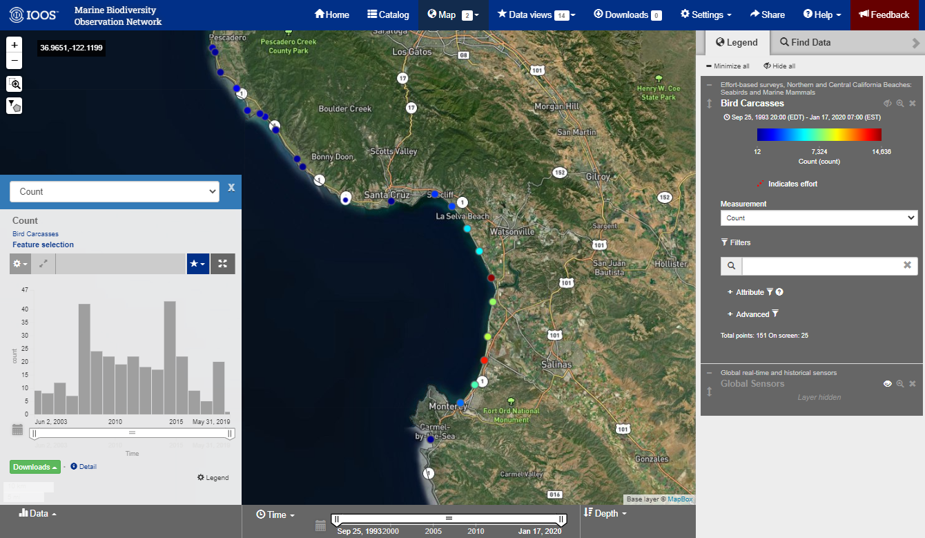
This is a sum off all of the most common Seabird Carcasses that has been found at this beach, as well as some metadata about the beach. We can also click on a site to see the time series of that site. Try it out!
Link to Map View with bird carcass layer loaded: https://mbon.ioos.us/?ls=R3ThwxNj#map
Filtering Data
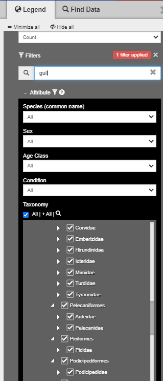
The portal has multiple ways to filter data: by time, by taxonomy, by collection group and more.
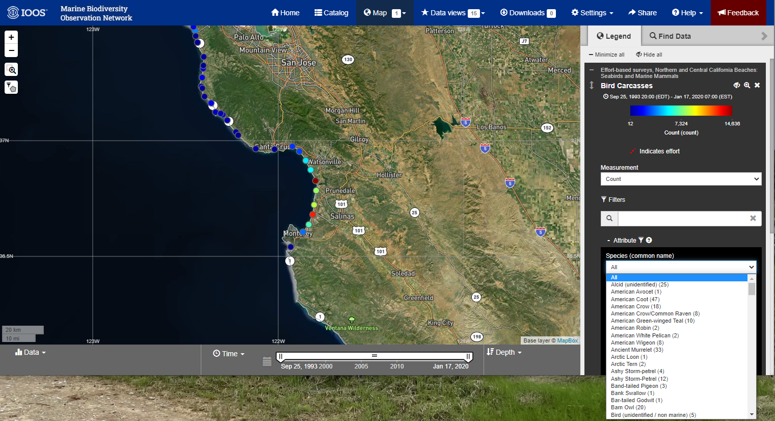
In the Legend box select plus sign next to Attribute and open up the Species (common name) drop-down menus. This will give a list of the common names of different birds that were identified.
For more information about filtering by taxonomy and organization see Appendix: Advanced Filtering.
Link to Map View with bird carcass layer loaded: https://mbon.ioos.us/?ls=R3ThwxNj#map
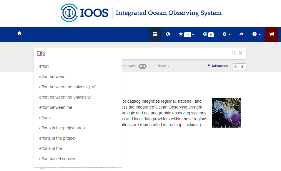
Keyword Filtering
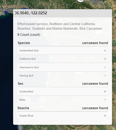
There are some other really cool filtering feature, try selecting a Species using the common name.
You can also use keywords to filter the data, try searching for gull.
Now when you hover over a site you can see that multiple species of gull are included in the filter.
Link to Map View filtered by gull: https://mbon.ioos.us/?ls=_f6KAdsb#map
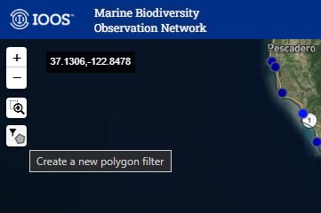
Polygon Selection
Select the polygon icon on the left-hand side of the page.
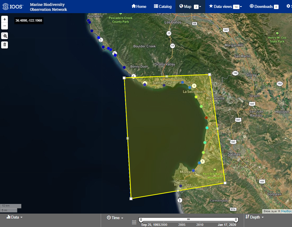
Now use that tool to draw a polygon around Monterey Bay. When you are done, double click on the polygon and this will extract a time series of all of the selected data.
Now let’s look at some specific mortality events and then include some environmental data from satellites.
Using what the tools we just showed:
- Filter the data to just select
Common Murre - Use the polygon selection tool to select the beaches around
Monterey Bay - Select a measurement of
Carcasses Per Km
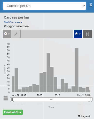
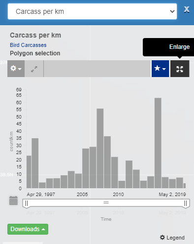
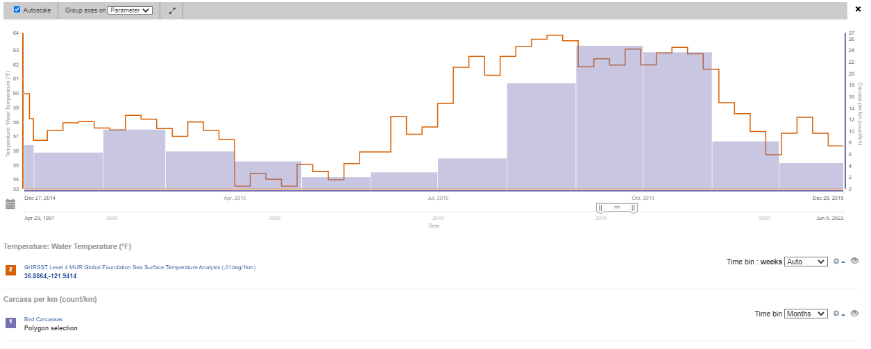
The results should be a time series plot that looks similar to this:
Let’s expand this plot by clicking on the Enlarge icon:
Now we can change how the data are binned through time. By default this dataset is binned into annual values, but we can also display the data for each month (the raw values) or by the season.
Click on the Time Bin pull down and select Months.
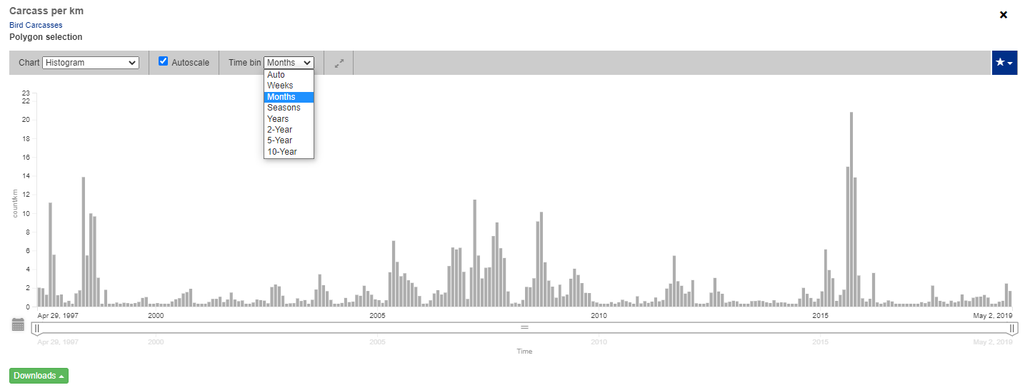
From this plot a couple of things stand out:
- There is a seasonal signal to Seabird Deposition - Fall and Summer tend to have higher deposition than Winter and Spring
- There are three unusual events that stand out
- 1997: El Nino year, HASS, and Gill Net mortalities
- 2007: Starvation event
- 2015: The Blob: Marine Heatwave
Link to Map View with polygon selected: https://mbon.ioos.us/?ls=BGIvnsro#map
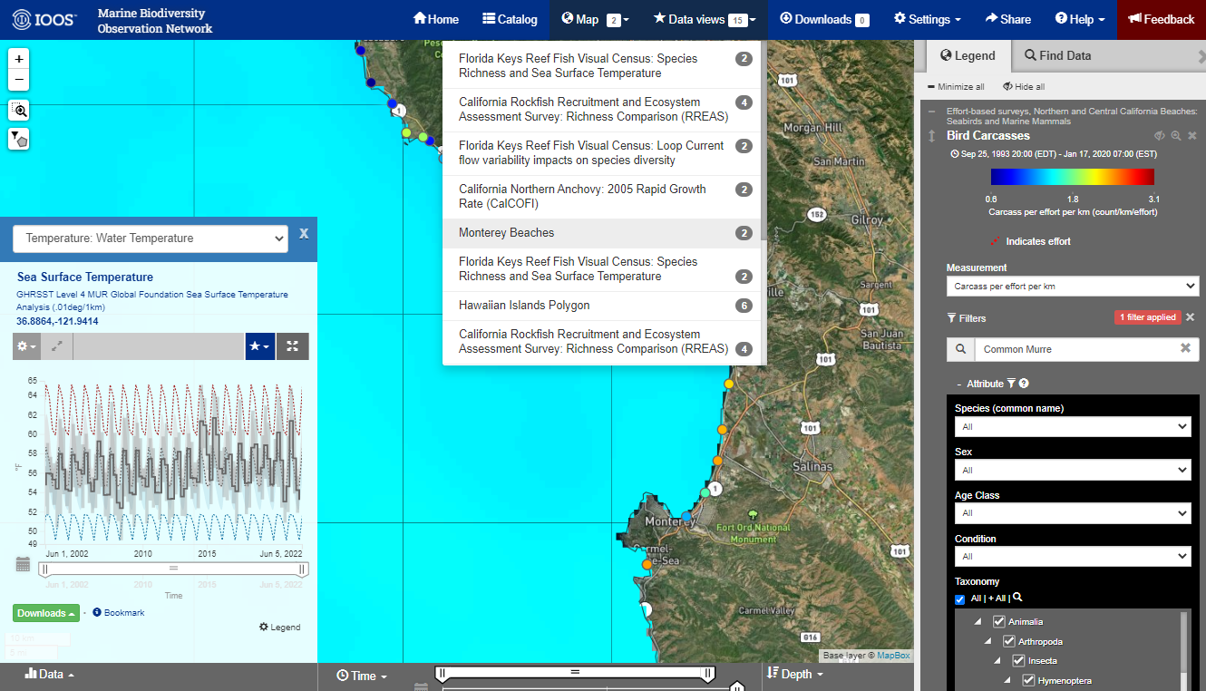
Adding/Comparing Sea Surface Temperature
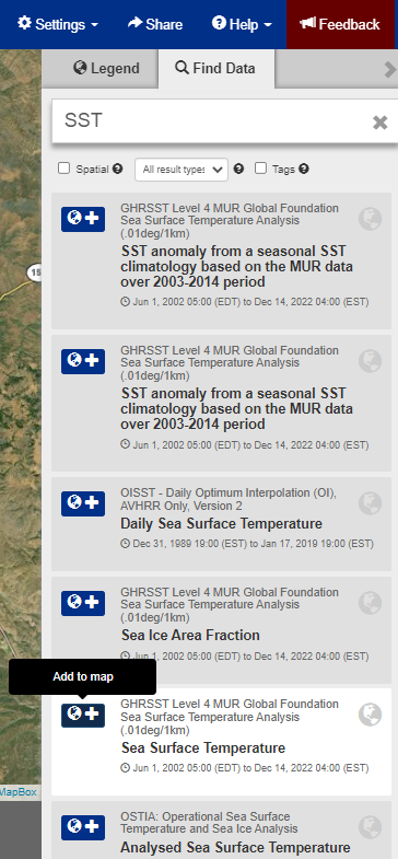
Let’s add the SST layer as measured from Satellites.
This can be found by searching the Data Catalog as shown earlier, but the data catalog can be easily accessed by selecting the Find Data next to the Legend in the Map Layer.
Now let’s search for SST and add the GHRSST Level 4 MUR Global Foundation Sea Surface Temperature Analysis (.01deg/1km)
layer by selecting the blue cross next to the name.
Now let’s create a time series of SST in the middle of Monterey Bay. This is done by creating a virtual sensor, a tool that extracts a time series at a single point out of a spatial dataset. This make take a second to load.
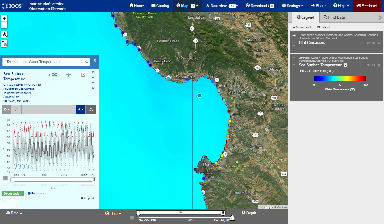
Once it’s loaded, try to see if you can expand the plot of change around temporal binning.
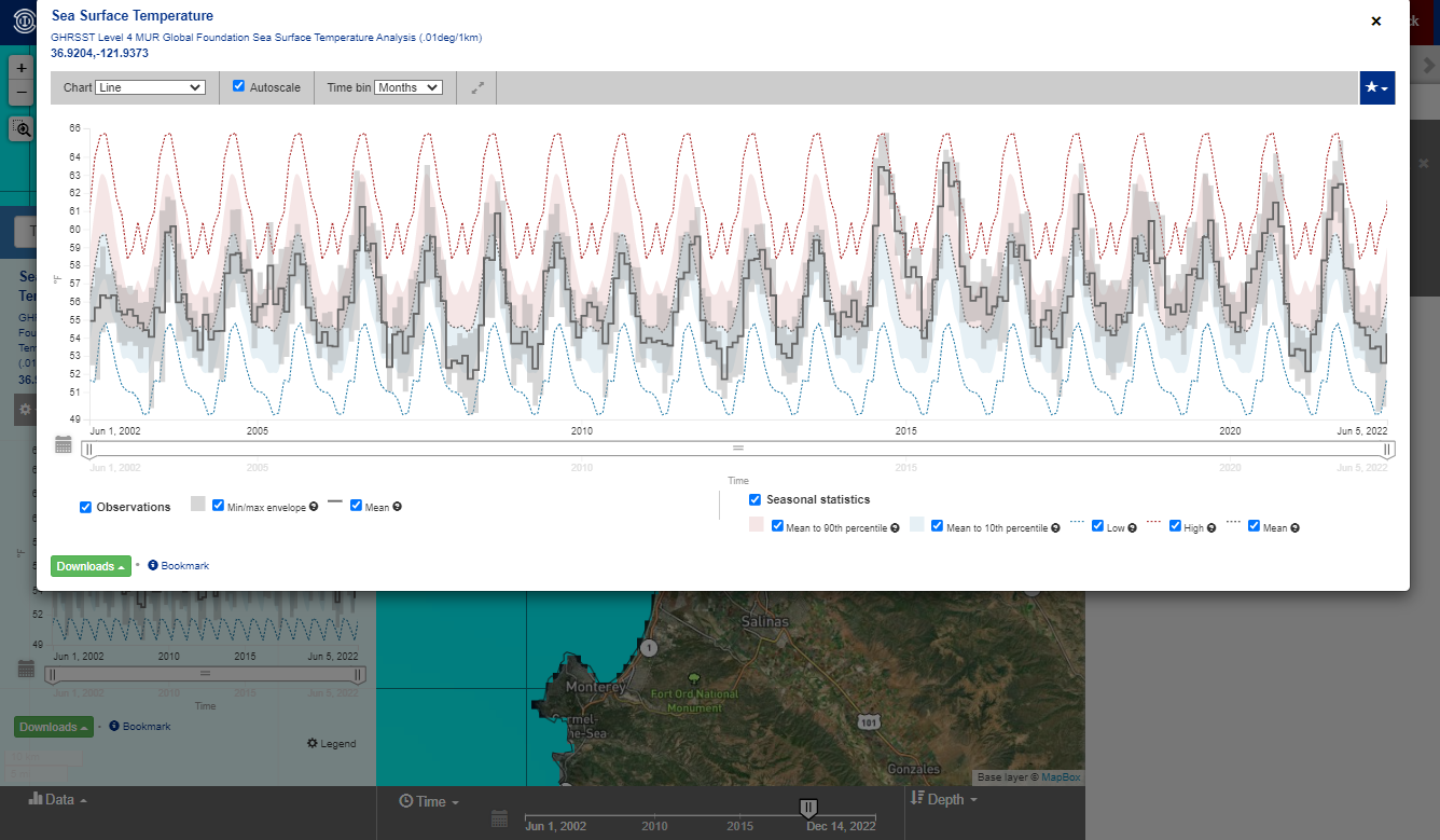
Tip: The portal has a ton of features and data. Feel free to poke around and try to break things!
Link to Map View with SST virtual station selected: https://mbon.ioos.us/?ls=hqKsfp0L#map
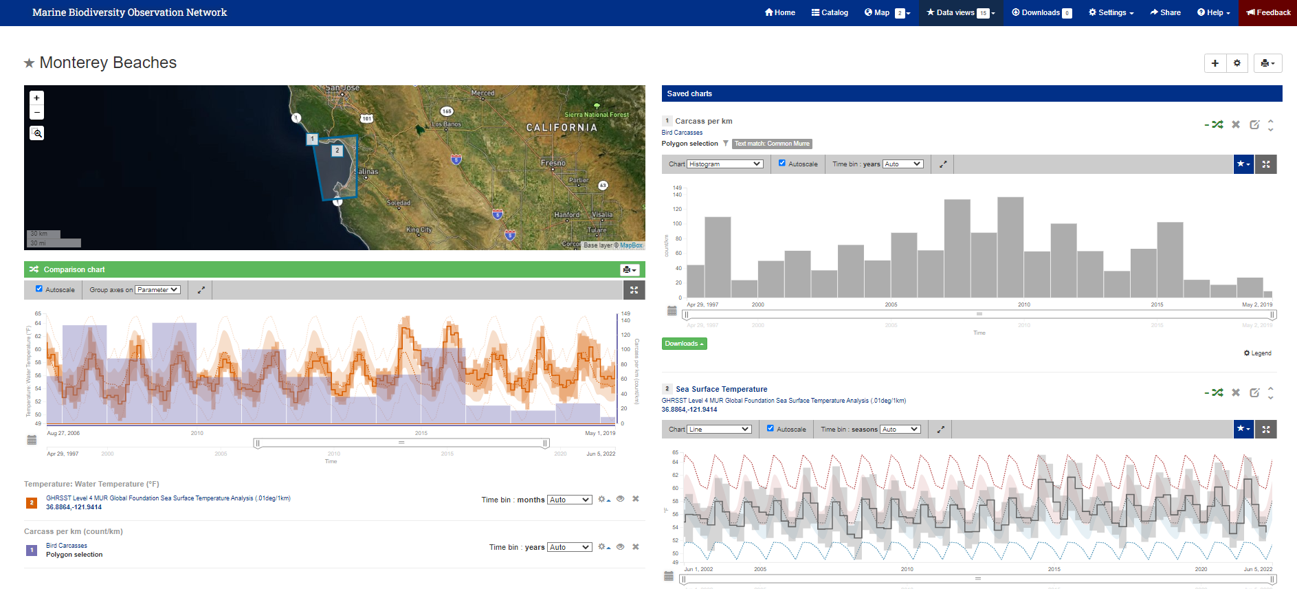
TOPIC: Comparing Data with Data Views
Note: If continuing from above, you will need to click the eyeball icon on the SST layer to hide layer.
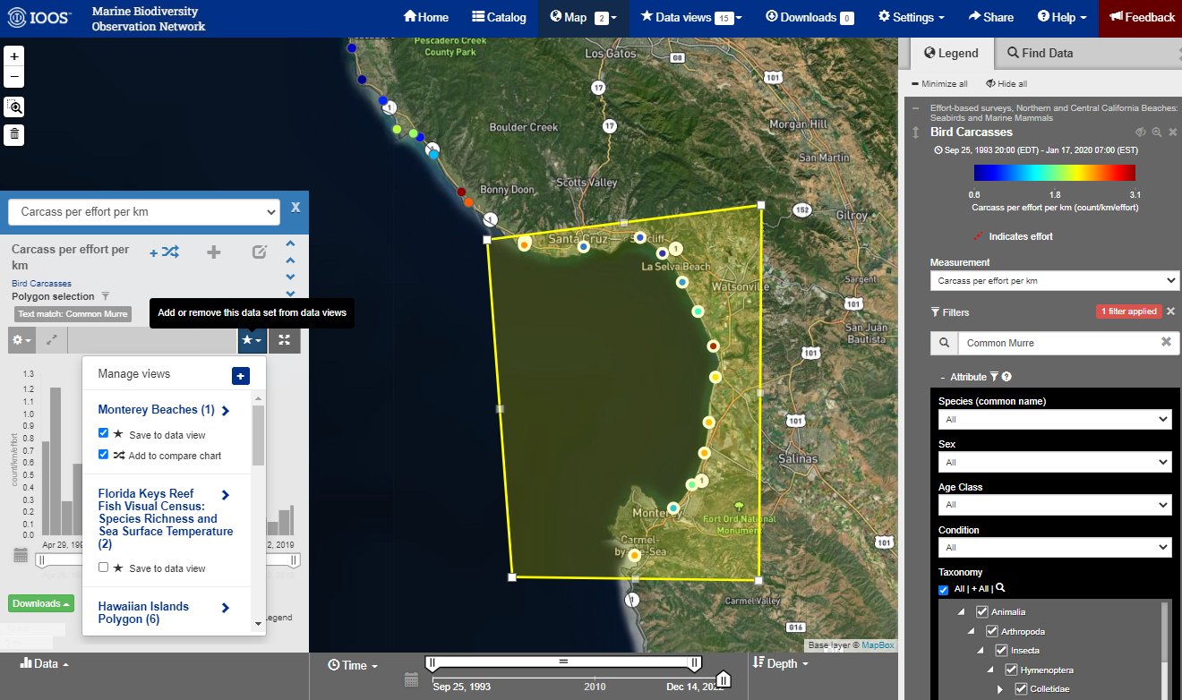
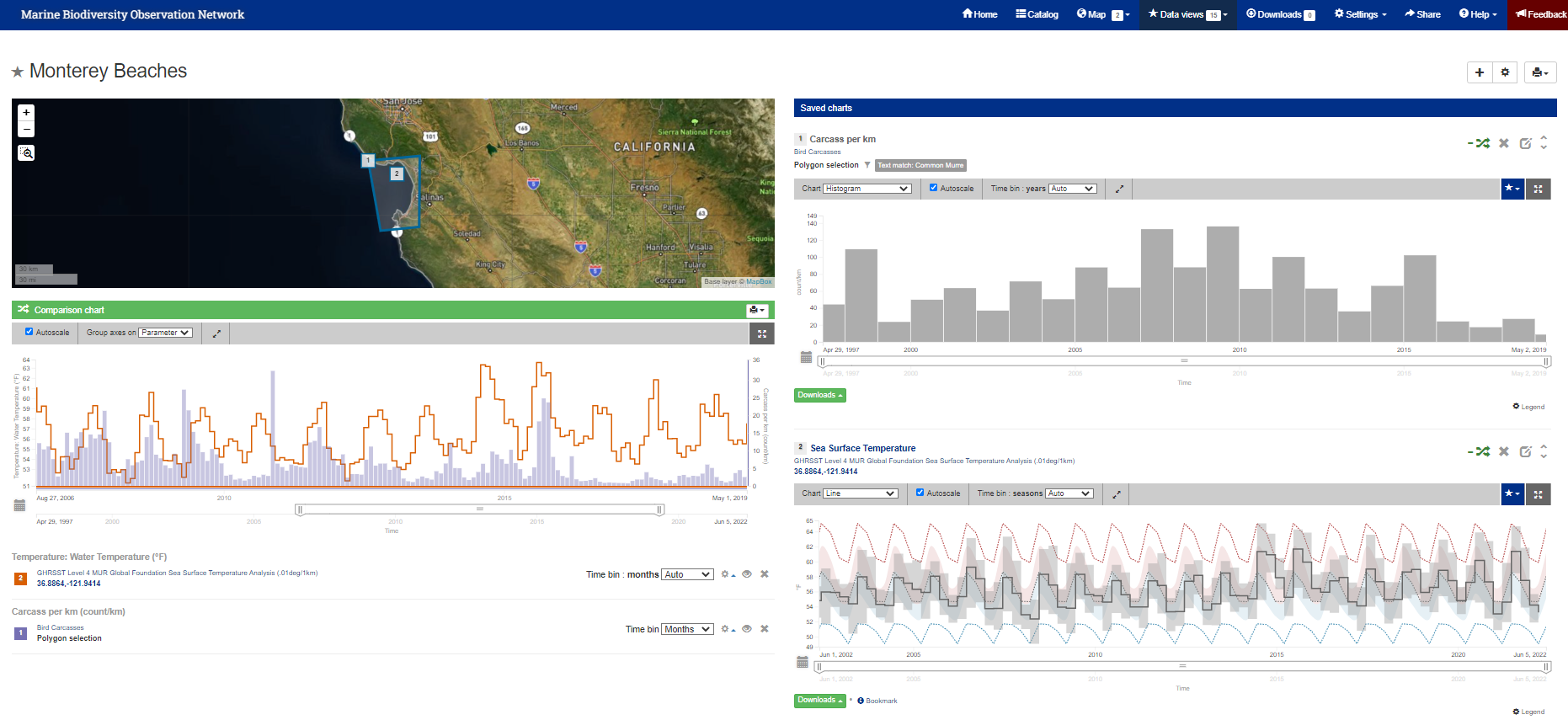
Now we can create a Data View to view multiple types of data on the same page. The first Data View will compare
Common Murre mortality events with SST.
- Filter the
Bird Carcasseslayer forCommon Murre - Use the polygon selection to select the Monterey Bay region.
- In the time series window, Select the Measurement of
counts per effort per km -
Create a new Data View by selecting the Blue Star button. Then select the Plus sign to create a new Data View. Give it a name (we named it
Monterey Beachesin the screenshot below).Then a check the two boxes to Save to data view and Add to compare chart
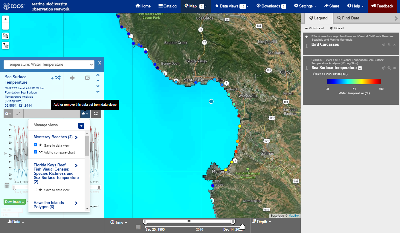
Now add SST time series to the Monterey Beaches Data view you just learned how to create from the middle of Monterey Bay.
See Adding/Comparing Sea Surface Temperature.
Note: If continuing from above, the SST layer should already be available as a map layer. You need to show layer by selecting the eyeball icon to see it on the map.
Pick a point on the map to create your virtual station for the SST time series. Add that to the Monterey Beaches Data view.
Finally, let’s look at the Data View! This is done by selecting the Data View button near the top of the portal and
selecting the data view you just created from the drop down menu (Monterey Beaches).
Here is the static link to the Data View we just created: https://mbon.ioos.us/#data/10
The Data View
There is a lot of information here, lets clean up some of these figures so we can more easily interpret what’s going on.
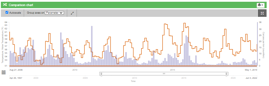
For the Comparison chart you can add/remove the various statistics presented on the chart by clicking Legend and checking/unchecking the desired statistics. Notice how the comparison chart adds/removes those statistics as you check/uncheck the boxes. Lets remove the Seasonal statistics and the Observations min/max envelope.
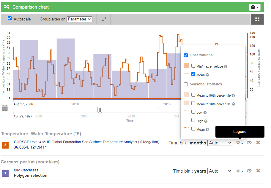
You can also adjust the time bin to appropriately bin the observations through time.
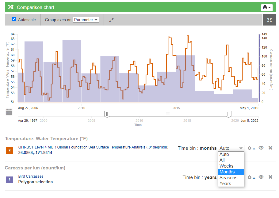
After cleaning up the statistics and appropriately binning the observations, our Data View should look like this:
Now let’s look at the SST data
The mortality following the 2015 Warm Blob really stands out, as well as the seasonality of carcass deposition.
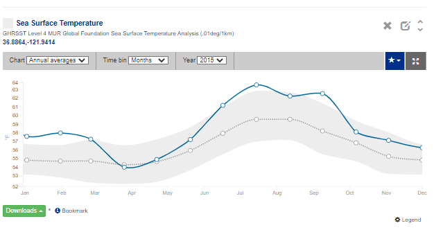
Let’s see just how warm the winter months of 2014 were. In the Saved Charts section of the Data View we can also
visualize SST as an anomaly or annual averages. Adjust the Chart to Annual averages and set the Year to 2015
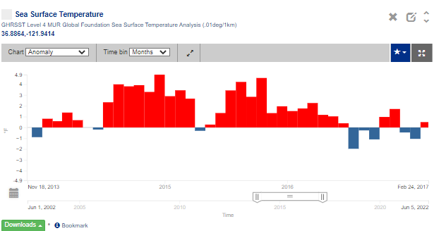
Now, adjust the Chart to Anomaly and use your cursor to zoom into 2015. Notice how warm 2015 was!
Go back to the Comparison Chart and adjust the time slider to only show data from 2015.
Here is the static link to the Data View we just created: https://mbon.ioos.us/?ls=HwIUygJm#data/10
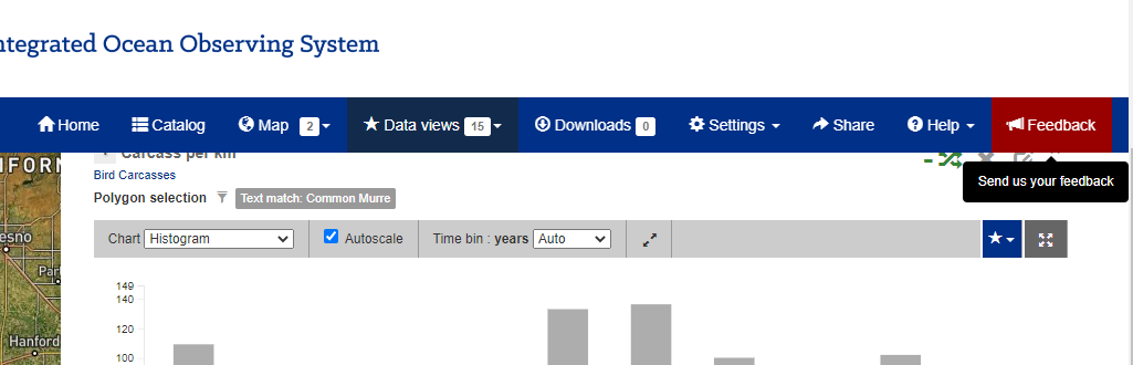
Finally: The Feedback Button
If you are having any trouble, something doesn’t look right, or really anything else. Please use the feedback button in the top right of the portal. This button will send us a link to what you are looking at and help us figure out what is going on. It’s also a great way for us to log suggestions, so if there is something you would like to see, we want to hear it!
Appendix: Using the Real-time Sensor Layer
The colors that you see on the map correspond to a different parameter being measured at a given location. By default we are seeing Air Temperature and the color corresponds to the most recent value (gray if no values have reported in 24 hours). Hovering over a circle will give us more information about the data stream and show some recent data.
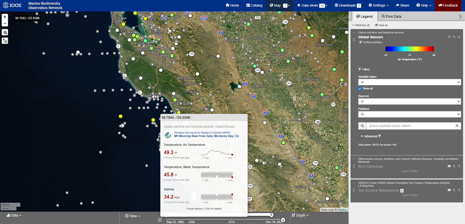
Here is the link to the Map View with the Global Sensors layer added: https://mbon.ioos.us/?ls=p4ZhOW1_#map
Appendix: Advanced Filtering
The portal has multiple ways to filter data: by time, by taxonomy, by collection group and more. In the Legend box select plus sign on the Advanced Icon. This will expand the filtering options.
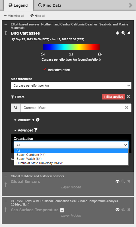
Now let’s select BeachCOMBERS from the Organization Drop down Menu.
Now if you zoom out on the map you will notice that it is only showing data collected by BeachCOMBERS.
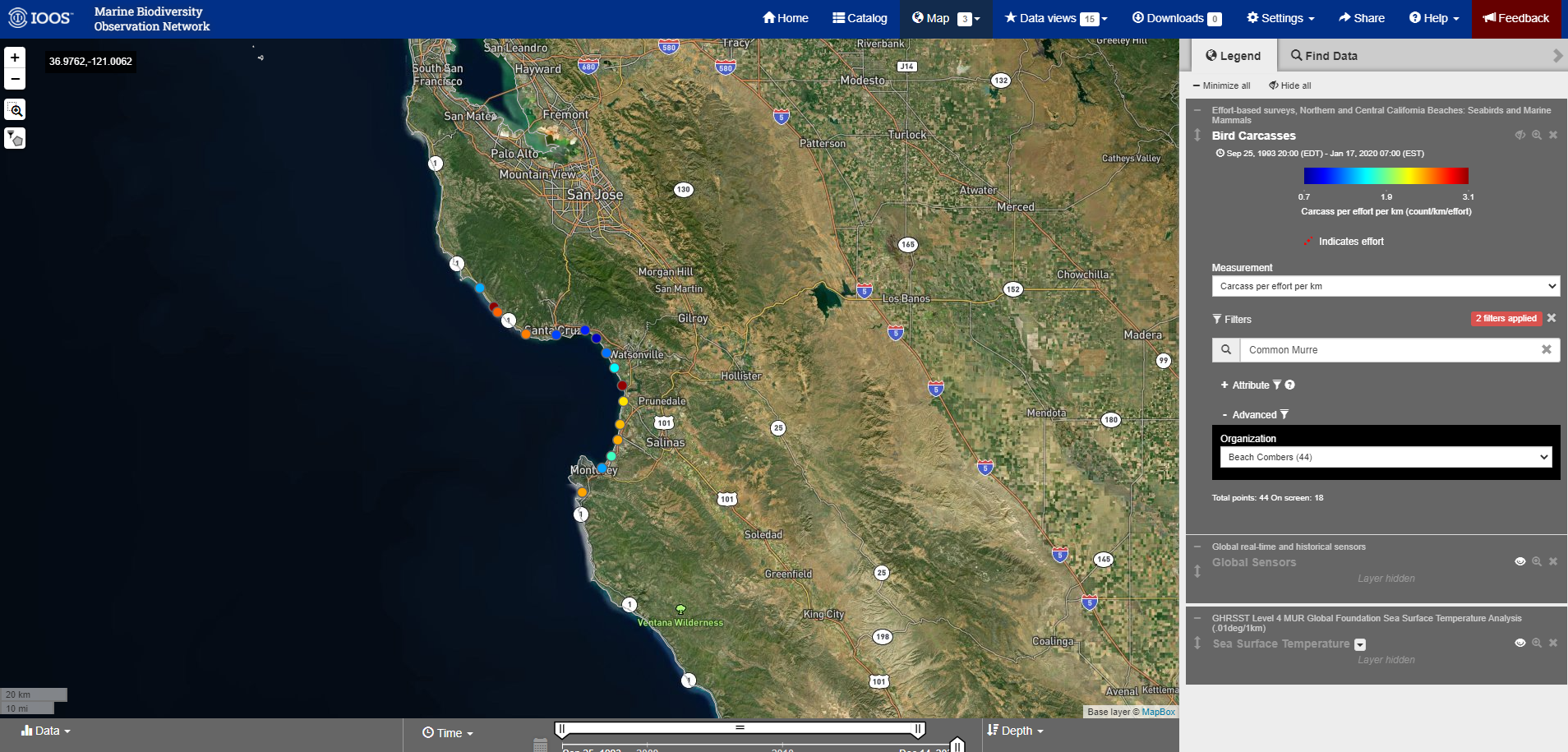
Here is the link to the Data View of the Bird Carcasses data layer, filtered by Organization of Beach Combers: https://mbon.ioos.us/?ls=n62ES453#map
Appendix: MBON Data View Challenge
Concept:
- Challenging partners to engage with the Portal and its tools to draft a demo Curated Data View for time series integration, and/or custom URL map view.
- Encourage all partners at all levels to engage and understand the potential for Portal use, and well as understanding its limitations and guiding future work.
- Challenge concepts can take as little as ~30 min to an hour or more to develop depending on background, intent and more.
- No programming or specialist computer skills are required!
Process:
- The concepts and background materials will be presented at the MBON DMAC meeting on 10 January 2023 (materials above).
- A follow-up ‘drop-in’ session will occur on January 24th from 3-4pm ET (Google Meet Link) as a basic Q&A to help folks who might have questions or need help as they develop a concept.
- We will close out the challenge during the next MBON DMAC WG meeting on February 14th 2023, where participants can introduce their concept and discuss issues arising such as strengths/weakness and informing future work.
To submit your final Data View, use the Share button at the top of the portal and send the link to Mathew Biddle by February 14th, 2023.